
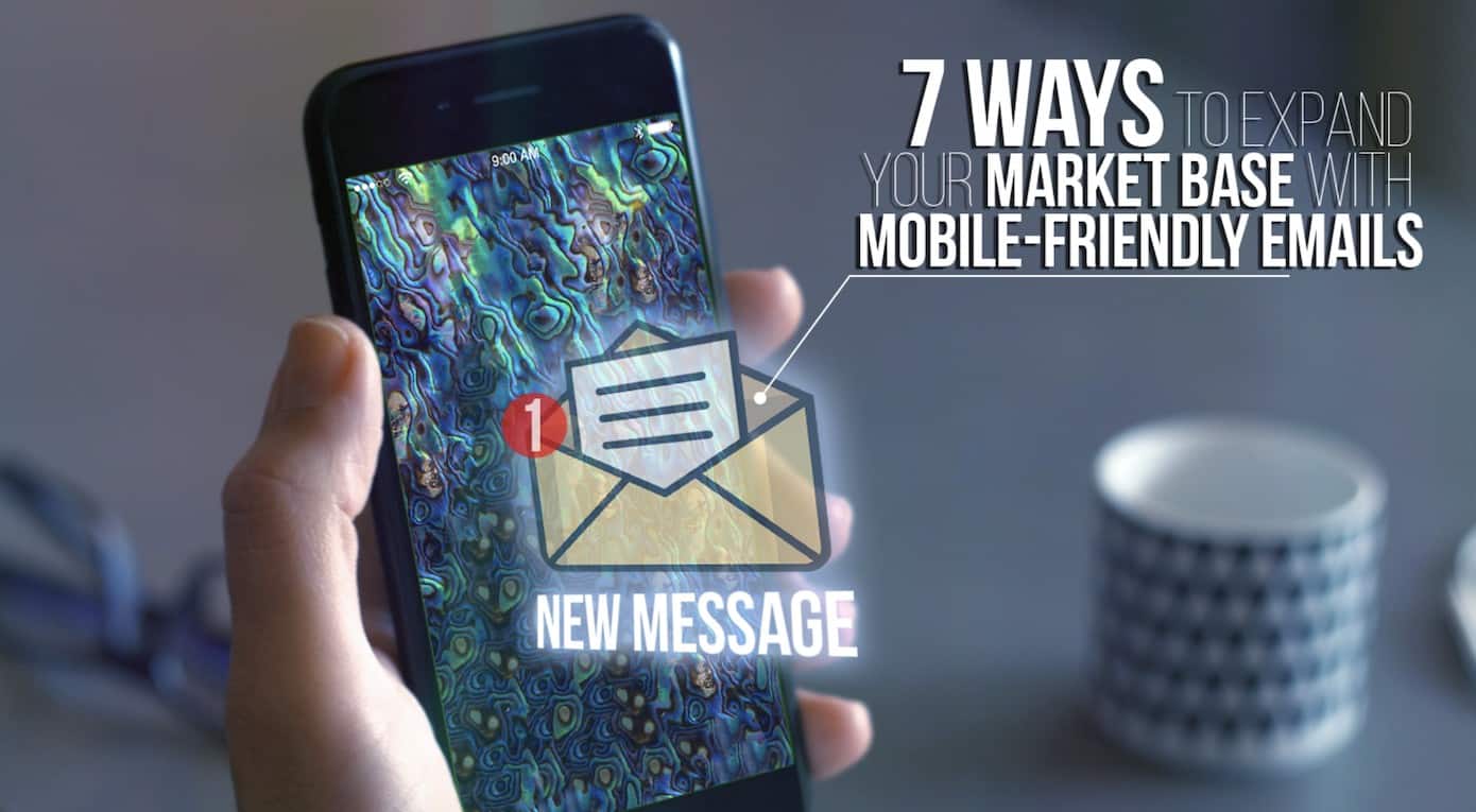
Mobile-friendly emails can maximize the effectiveness of your deliverability and messaging when it comes to engaging with your target audience.
In today’s day and age, people use a number of devices for online tasks, including, shopping, social media, and email.
That’s why optimizing your emails for all devices and screens is so crucial.
Mobile-friendly emails can result in higher open rates, higher click rates, and an overall increase in success. Emails that are optimized for mobile devices are responsive, which maximizes readability no matter what screen size they’re displayed on.
Mobile devices have taken online retailers by surprise. In 2017, nearly 56% of website traffic came from non-desktop devices. And if anything, those numbers have increased since then.
What does this mean for you? More opportunities to convert a large portion of the traffic that comes to your site on a mobile device.
During BFCM 2019, 69% of online purchases were completed on mobile and handheld devices. Let’s face it, the future of “mCommerce” is going to be huge.
Gaining access to your mobile visitors is one thing. But there are more opportunities to improve your mobile-friendly emails so they’ll actually convert.
7 Strategies for Creating Effective Mobile-Friendly Emails
1. Ready to use templates
In case you don’t know it, you don’t really have to start from scratch! There are free mobile-ready templates that are ready to be used!
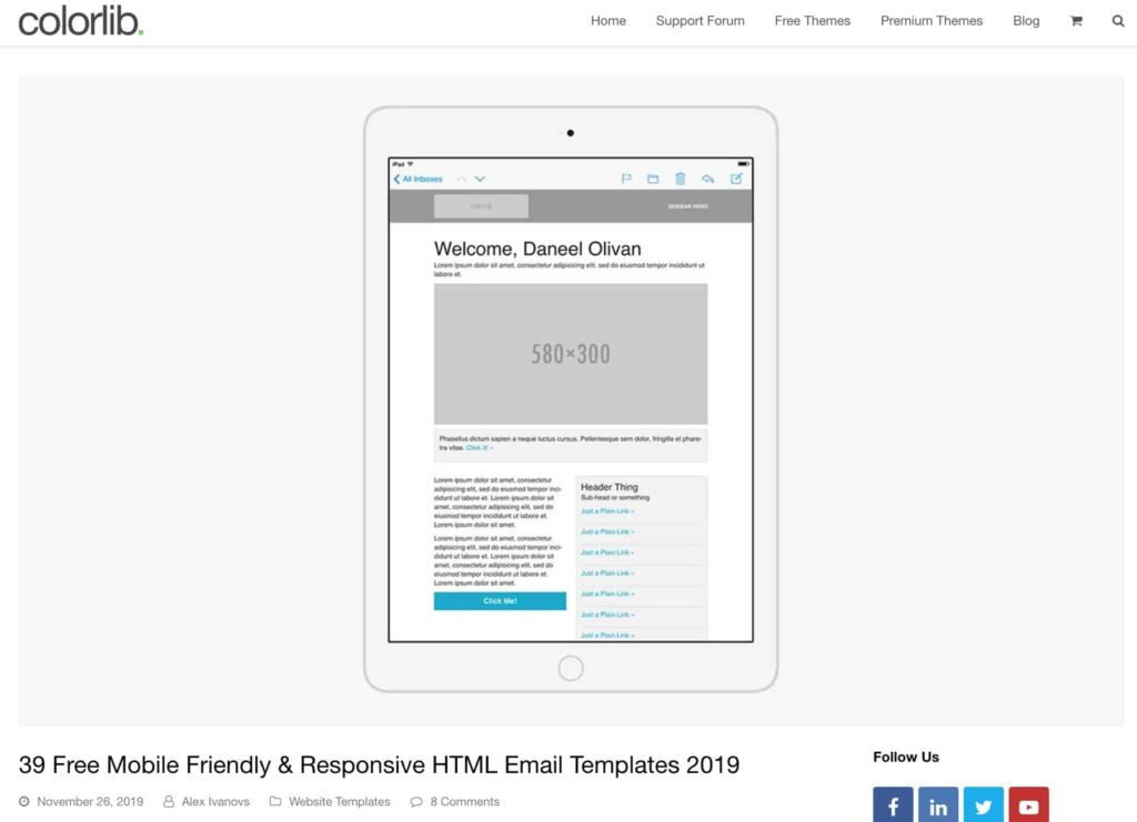
Check out Colorlib, and relax. These templates are easy-to-use and a great place to start.
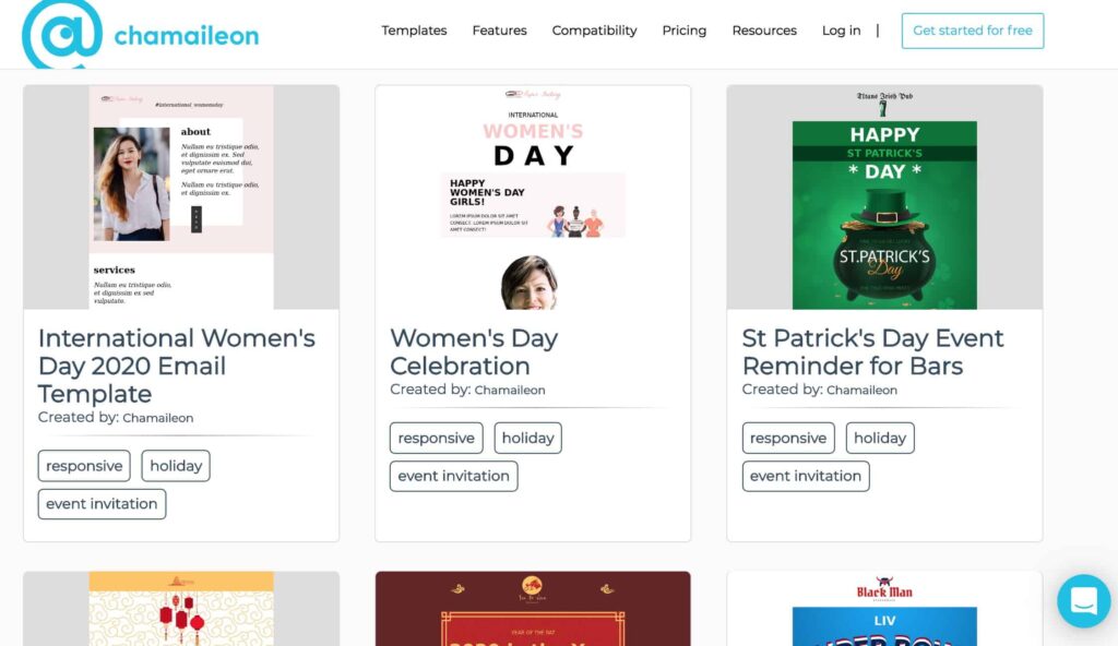
Chamaileon also provides various email templates you can edit online and download as HTML. And yes, they have responsive email templates for almost any occasion.
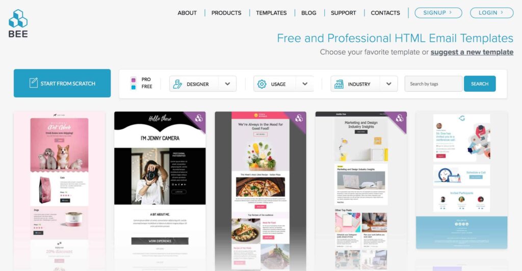
Another site is BeeFree. It has a pretty large collection of templates. BEE actually stands for “Best Email Editor,” so there’s a good chance you’ll find something you like.
Working with an email marketing agency is also a convenient alternative, as they have extensive experience when it comes to optimizing emails for mobile devices. You can direct them to templates you like or let them create original layouts for your brand.
2. Optimize your subject lines
Subject lines are the gateways to your emails. While best practices for creating subject lines have long existed, they have evolved to include mobile devices. Keep your subject lines short enough so that they can be viewed on mobile phones.
According to Campaign Monitor, the character count of your subject lines should be well below 30. If you go beyond, the rest will get cut off.
3. Use your preheader text to grab attention
The preheader text is like a one-line synopsis of a movie. It should reel in your customers using as little words as you can. Why? Because next to the subject line, the preheader text will give your customers an idea of whether they should open your email or not.
Check out this chart for a clearer idea of preheader character limits for different devices.
4. Optimize the From Name
What are you using as your ‘From’ name?
Did you know that 68% of Americans base their decision to open emails on this? So how can you use this knowledge to your advantage? Make sure that your From name is consistent and matches your branding.
While some stores use the actual store’s name as the From name, an emerging strategy is using actual names of the store owners or sales team. That way there’s a human touch.
5. Balance the sizes of the images and the copy
It’s understandable to want to include a lot of important info in a single email.
However, while it may look okay on a computer or a laptop, it might look too cramped and jam-packed on an iPhone. You have to take the extra step and check to see if the design and content will look good on all devices.
Keep your text content brief and straight to the point. Give your recipients just enough to make them want to know more about what you’re offering.
Don’t use graphics with words in them as much as possible. That way, you won’t have to worry about any text in your graphics still being readable or not if the image needs to be resized.
6. 45 x 45px to 57 x 57px (It’s not Greek, It’s Bigger CTAs)
Customers don’t need to have big fingers to make typographic errors or tap on the wrong buttons. Don’t give your customers a hard time! Make it easy for them to tap your CTA buttons so their purchase can be smooth and seamless.
According to Campaign Monitor, the optimal size for your CTA button should be 45 x 45px to 57 x 57px.
Also, make sure your CTA button colors contrast with the background color of the rest of your email. Make those CTA buttons stand out to your readers!
7. Use Mobile-Ready Landing Pages
Lastly, when your emails are all optimized, your customers will easily decide to click on your CTA button. This will lead them to your respective landing pages. Oops! Are your landing pages optimized too?
Remember, you’re managing customer experiences. Don’t let them down by leading them to a landing page that is not optimized for their device. Consistently deliver a seamless and pleasant experience as users navigate through and purchase from your store.
The Future of Mobile-Friendly Emails
Technology is growing faster than ever. It won’t really be a shot in the dark if there will be more ways to view emails in the near future.
Currently, however, mobile devices are still the winner when it comes to usage and open rates. While optimizing mobile emails to convert, what are you doing to convert your onsite traffic from mobile visitors? Klaviyo has made a very good point about using smart pop-ups on your website.
As an eCommerce entrepreneur, it’s your job to ensure that you always have the upper hand. With mobile-friendly emails, you’re one step closer to email marketing success for your brand.
Whether you’re seeing an upsurge of healthy traffic from mobile visitors or planning on supercharging your emails to convert better on mobile, you can always talk to the email experts on how to do this.
And with these handy tips, you’ll soon have mastered the art of mobile conversions and gaining subscribers from your mobile visitors.
Related Posts:

