
We've been on a trek recently to understand best practices for increasing landing page conversions. Some have been more obvious than others.
Today, we'll be taking a closer look at landing page buttons and how small changes can increase engagement and click-throughs.
Read: Part 1 / Part 2 / Part 3
How to Create High Converting Landing Pages Part 4 — Landing Page Buttons
Effective buttons are visually engaging, persuasive, and personal whenever possible. There are lots of studies to determine what gets people to click, and the most important lessons for landing pages include:
1. Choose a Contrasting Color
If you’re making call-to-action landing page buttons, red is a good choice. According to recent research, red gets the most clicks, followed by green, then orange and yellow, and then blue.
But you aren’t picking your button color in a vacuum. Aesthetics and design are also important, so choose a color that stands out on your page -- and run some tests to make sure you’re right.
Let’s use this Unbounce landing page as an example. The design elements are almost all blue, but there’s a big, obnoxious, orange call-to-action (CTA) button in the middle:
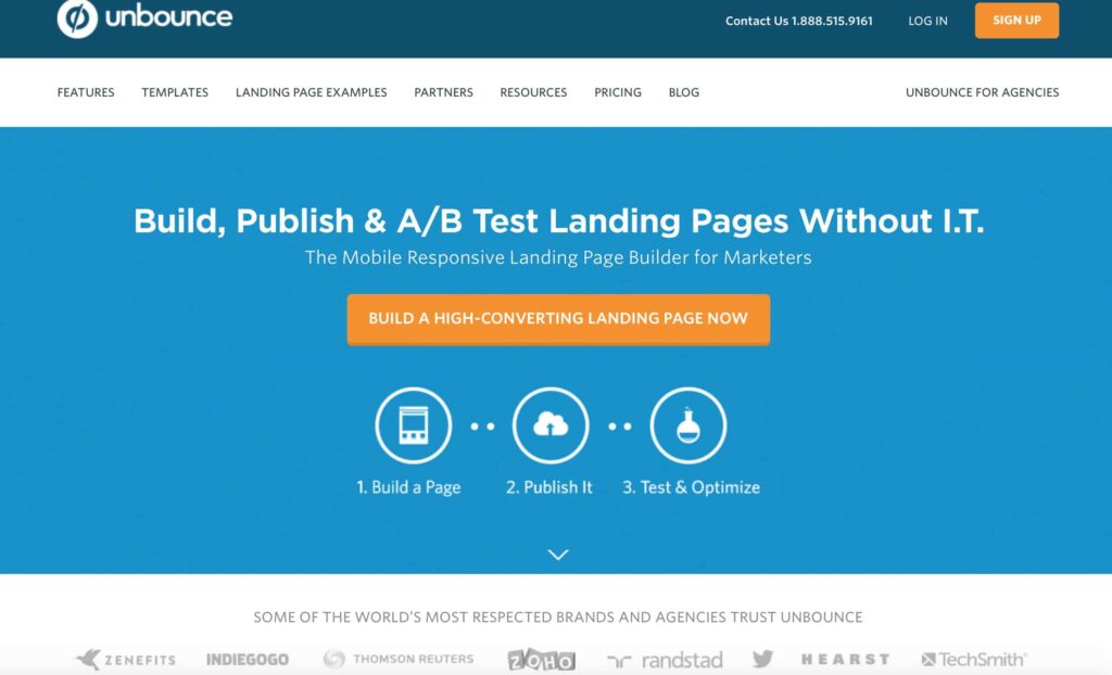
Since Unbounce is a landing page service, it’s nice to see that they practice what we preach. - image source
If you aren’t sure which colors are complementary and which are contrasting, refer back to the color wheel we all studied in grade school.
2. Size (and Shape) Matters
The size and shape of your landing page buttons can influence your landing page conversion rate as well.
We’ll start with the obvious. If you want someone to click, a bigger button is usually better. And if possible, leave some space around the button to reduce possible distractions, as Matchpool does here:

Also, note the "Isolation Tank" effect we discussed in Part 3 - image source
Notice that even though the teal button is more complementary than contrasting, the deep purple background and lack of clutter still draws the eye to the main CTA. (Even more so than the small pink button in the top right corner.)
Also, you’ll notice that just about all of the CTAs we’ve featured have rounded edges, not sharp ones. This isn’t an accident. User experience specialists say that buttons with rounded corners convert at a higher rate than those with sharp corners.
According to Wordstream, this is probably true for a number of reasons. Our brains often recognize sharp corners as a threat on a subconscious level, or as arrows directing our attention elsewhere. Rounded corners, on the other hand, are easier on the eyes and the brain.
All that said, you can’t know what CTA will work best on your audience until you...
3. Test Your Button Elements
We mentioned testing in passing above, but it’s important enough to merit its own discussion.
Yes, you should test the size, shape, and color of your landing page buttons to see if you get a conversion increase. But sometimes the text in your CTA is more important than the design elements -- so you need to test that too.
Conversion optimization guru Michael Aagaard says that the most important elements of your CTA are relevance and value. In other words, just another way of answering the “what’s in it for me?” question for your audience.
Also, you can get even more detail-oriented by testing the following changes:
- Font color
- Replace “Your” with “My” (example: “Get My Free Quote”)
- Benefit-oriented verbs (“Get”) in place of neutral ones (“Send,” “Submit”)
- A hover effect to change the button color pre-click
- A right-pointing arrow after the text
These adjustments might seem too small to make a difference, but they add up. Aagaard tested these button and copy principles on a landing page and boosted signups by more than 31%.
Where To Start With Your Landing Page Buttons
If you aren’t sure where to start testing your landing page buttons, numerous brands have already paved the way by using calls-to-action with specific colors, shapes, and sizes.
Landing pages by leading sellers like Amazon, Apple, Target, and more are constantly using analytics to update their on-page elements so they can maximize conversions. Take note of what they’re doing and test similar updates in your campaigns.
Stay tuned for the final post in our High Converting Landing Pages series. And for more premium and exclusive online marketing tips, visit Join.AdLeaks.com.


Related Posts:

