
Lots of brands spend countless hours revising and refining their logo, but what happens when that logo goes out into the big, bad world?
You’ll need to use your logo in a variety of ways, including animations. And you’ll need to stick to a few basic principles to ensure that your logo and brand are well-represented when the animation is complete.
So here are three do’s and don’t’s of logo animation, starting with…
1. Contrast
One of the most important choices you can make with logo animation is to include contrasting colors. Evolution has trained our eyes to seek out and fix on these visual ‘disruptors,’ so incorporating contrast is crucial here.
How to Use Contrast in Logo Animation
First, make sure you’re using contrasting colors between the background and the foreground. You want your animated logo to be the element that draws viewers’ eyes, not the thing they’re looking past to see what’s behind it.
That said, you should also experiment with an interesting background to enhance the logo. The right combination of movement and contrast can give you a memorable look that you can hang your brand’s proverbial hat on.
Contrast Don'ts
This one should be obvious (as a lot of these “don’ts” will be), but don’t make your logo difficult to read. It’s fun to play around with explosive colors, animations, gradients, etc., but don’t forget to keep the main thing the main thing.
Similarly, make sure that you don’t use a background that distracts from the logo itself. If the animation or design is overpowering your animated logo, it’s time to rethink your approach.
2. Branding
If you’re creating a new animated logo for a brand, you can’t move into the future without looking at the past.
We’re not trying to be cryptic or philosophical here. We’re talking about the brand’s existing visual style — colors, fonts, lines, the works.
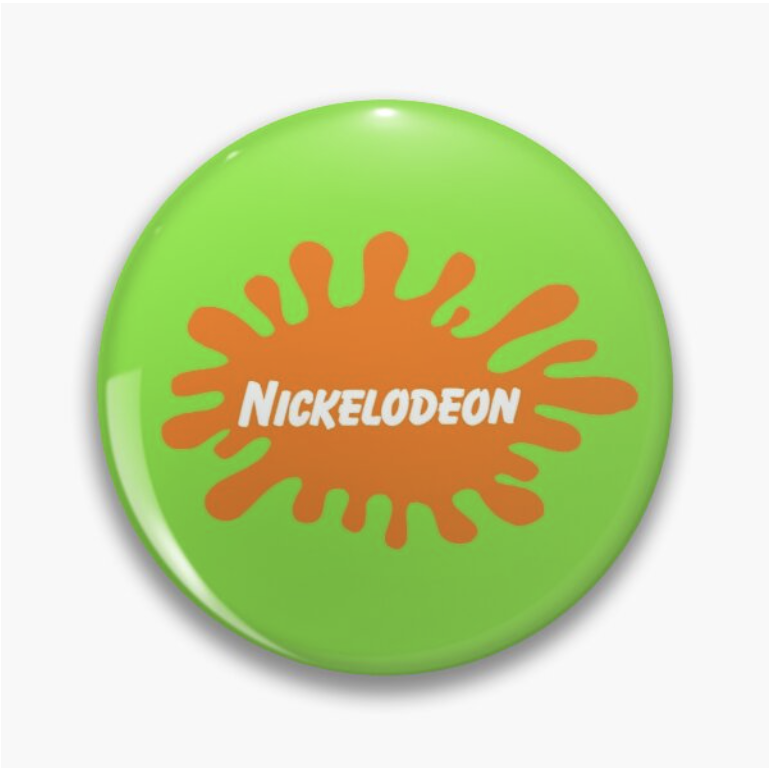
If you were making an animated logo for the Los Angeles Lakers, for example, you’d use purple and gold, not orange and green.
If you made an animated logo for Nickelodeon, however, you’d do the opposite.
Sticking to this rule is probably the most important takeaway here. If you stay within a brand’s established look, you’ll get fewer revision requests and a lot more pats on the back.
How to Use Branding in Logo Animation
First, make sure you have the brand’s specific colors and fonts on hand when you’re developing your logo animation. Ask for branding guidelines or a brand’s “lookbook” to verify that information. There should be existing colors in the logo that you will want to refer to as well.
Also, make you consider the tone and audience of the brand. Returning to the example above, an animation made for the Lakers' audience probably won’t play as well for the Nickelodeon audience, and vice versa.
Branding Don'ts
When you get those brand guidelines, don’t ignore them! Again, your animated logo should be a seamless extension of the brand’s existing marketing materials. You don’t need to reinvent the wheel here.
Also, don’t alter proportions or “warp” the logo in any way, and make sure that the logo isn’t pixelated or low-resolution in your animation. Clients and sharp-eyed customers will spot these issues and your credibility will suffer as a result.
3. Keep it Simple(ish)
The widespread availability of modern computer animation tools makes it easy to “go big” when you’re creating an animated logo.
That doesn’t mean it’s a good idea, though.
Remember, you’re animating a logo for an existing brand, not coming up with a whole new marketing campaign or targeting a new audience. Stay simple, stay focused, and stay on target.
How to Keep Your Logo Animation Simple
If you’re creating an animated logo, keep the spotlight on the logo, not the animation. Don’t get so caught up in the latest tricks that you lose track of the project goal.
And again, keep the tone of the animation consistent with the brand. If you’re animating a luxury watch brand logo, for example, the design choices you make should be wildly different than a logo for a fast-food chain.
A Few More Don'ts
Most of this post is about putting rules and guidelines in place, but there’s still a lot of room to create and innovate. So don’t be afraid to experiment with different techniques. And don’t be boring — failing to create an impression is a problem too.
Our last “don’t” is the flip side of keeping it simple — don’t make your logo animation overly long or complicated. Less really is more oftentimes.
Final Thoughts on Logo Animation
A great logo animation might seem like a thankless task. But if you create something visually interesting that represents your brand well and resonates with your audience, you’re doing something important, even if it seems invisible.
WKND Digital is a full-service eCommerce marketing agency that leverages world-class content, CRO, and more to help DTC brands scale profitably. Schedule a call with us to find out how you can take your brand to the next level.


Related Posts:

